
Design system · Product development
How separate interfaces became a product family
Why I redesigned my websites and Windows apps — and how colours, spacing and behaviour grew into a shared design system.
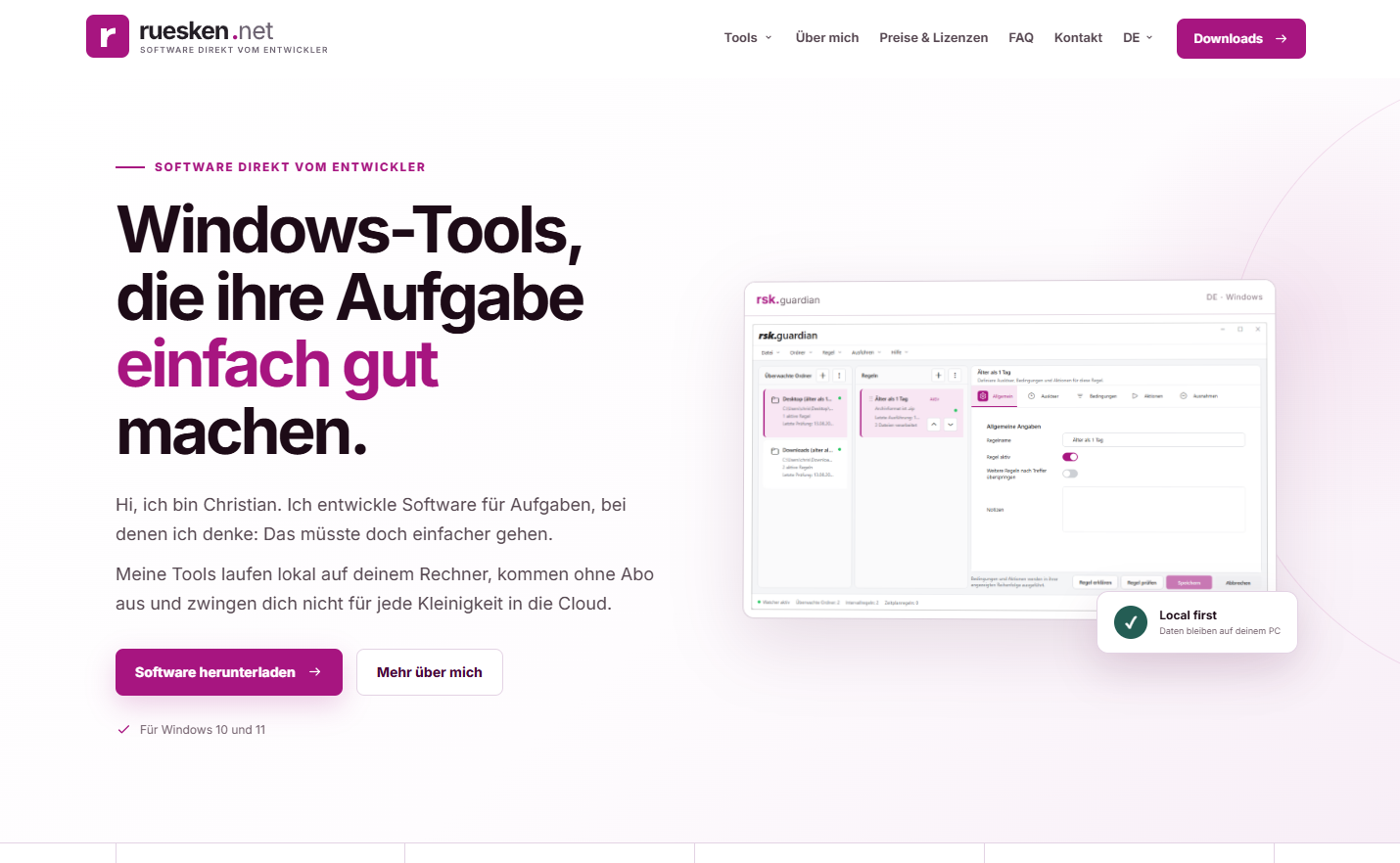
There is that moment when you put several of your own applications and websites side by side and think: they all belong to me — but apparently they know nothing about one another.
Each had grown over the years. Each had its purpose, its users and its own little quirks. Functionally, everything was there. Visually, though, the products told stories from different decades. Some buttons looked as if they had only ended up on the same hard drive by accident. Spacing depended more on the mood of the day, and a heading could have a very different idea of its own importance depending on the application.
That was the starting point for the new design.
Why not simply make everything a little prettier?
A new colour, more modern fonts, a few softer corners — that would have settled things quickly. At least at first glance.
But design is not decoration you apply to a finished product at the end. It helps people understand an interface. What matters? Where do I start? What happens next? Which action is safe, and which is final? And why does a dialogue behave differently in one application than in the next?
The longer I spent with these questions, the clearer it became: I wanted more than a fresh coat of paint. I wanted a shared language for all the products.
The websites and apps should be recognisable at first glance as part of the same family. Not like identical twins wearing the same shirt just to be safe, but like good siblings: with their own personalities and recognisably shared values.
Tidy up first, then design
So the work began with an inventory rather than a colour picker. Which elements keep appearing? Where do similar workflows differ for no good reason? Which information really needs attention — and which is just making noise?
It soon became clear that many supposed design problems were actually structural problems. If five things are shouting “Click here!” at once, you do not need five prettier buttons. You need to decide which one actually matters.
So things were reduced, organised and prioritised. Navigation became clearer, copy shorter, actions more explicit. Individual screens became understandable workflows. Design could only come in once it was clear what the interface was trying to say.
The rules behind the interface
A design system gradually grew out of those decisions. It defines more than colours and font sizes: it defines the logic behind the appearance.
Colour provides direction. Typography creates hierarchy. Spacing makes related things look related. Lines, corner radii and surfaces give interfaces their rhythm. And states — active, inactive, successful, failed or currently busy — follow the same understandable logic everywhere.
At first, that sounds like a collection of small details. But that is exactly where the strength lies. A single gap of eight or twelve pixels does not change a product. Hundreds of consistent decisions very much change how calm, reliable and natural it feels.
To me, a design system therefore begins with the decision not to answer the same question from scratch in every project, rather than with a colour palette.
One language, different dialects
Consistency does not mean making every interface look identical. A personal website has a different purpose from a tool that renames files or generates QR codes.
On ruesken.net and in the rsk tools, bold magenta creates recognition and energy. On christian-ruesken.de, deep blue, generous white space and editorial typography define the character. The colours are deliberately different. The underlying principles remain the same: clear contrasts, generous surfaces, a calm hierarchy and a few distinct accents.
This allows each application to play its own role without losing touch with the family. The system is not a straitjacket. It is more like a shared grammar for telling different stories.
From the website to the Windows dialogue
The real test came when putting it into practice. A design system can quickly look convincing in an overview of colours, fonts and components. Things get interesting where real software begins.
For rsk.files, rsk.guardian, rsk.rename and rsk.qr, the new design had to work beyond the opening screens. It had to prove itself in settings, empty states, progress indicators, error messages and confirmation dialogues. A primary button needs a clear role. A risky action must not look harmless by accident. And when a task takes a few seconds, the interface needs to show that it is working without becoming restless.
The websites raised different questions. How do navigation, cards and calls to action behave on a large monitor and on a smartphone? How do long texts remain easy to read? How much room does a project need for a screenshot to make an impression without overwhelming the content? Here too, individual decisions became reusable patterns.
Step by step, the system spread through every project. Through translation rather than copy and paste: the same approach, adapted to the medium, task and context of use.
The invisible half of the work
Of course, good design lives beyond the views that will later look particularly tidy in screenshots.
It lives in long filenames, unexpected error messages and windows someone makes surprisingly narrow. In keyboard focus, understandable states and text that still needs to fit when it becomes a few words longer. In small displays, high scaling and the rare but reliably recurring edge case that nobody considered in the first draft.
That is where a beautiful idea became a robust system. Every application revealed new questions. Every answered question made the next implementation faster and more reliable. The products improved one another: a solution that worked well in a Windows tool also sharpened the logic on the website, and vice versa.
What changed as a result
The most visible result is, of course, the new appearance. What happened underneath matters more.
Today, the products feel calmer, clearer and more familiar. Anyone who knows one of the tools can find their way around the others more quickly. New features no longer have to start from scratch in design terms. Decisions can be made using shared rules instead of renegotiating personal taste every time.
Development has benefited too. Reusable components and defined design values save time. Changes can be carried across several projects in a more controlled way. And because design and technology are no longer considered separately, there are fewer gaps between the concept and the finished product.
Above all, the whole thing now feels right: like a connected body of work rather than a random collection of individual projects.
Finished? Of course not.
A design system is never truly complete. Products change, requirements are added, and sometimes a single unusually long piece of text reveals that a supposedly perfect component still has something to discuss.
But that is exactly the appeal. The system provides a reliable foundation for the next questions rather than final answers. It keeps growing with every project, just like the software and the person developing it.
And when I place the websites and applications side by side today, I no longer see six interfaces that happen to share an author. I see a product family. One with different personalities, a shared language and pleasantly little disagreement about how big a button should be.